More Money, Fewer Problems
Sometimes, facilitating loans for small credit unions means having to get into the business of creating custom websites. We simplified the setup process for LendKey's internal team, and I automated color application to meet needs for accessibility.
01 / context & considerations
LendKey is a cutting-edge FinTech company revolutionizing the way people access and manage student loans. Their niche in the student loan market lies in connecting borrowers with a vast network of community banks and credit unions, offering competitive rates and personalized lending solutions to make education financing more affordable and accessible for all. An essential part of connecting students and customers of other loan products with the local credit unions that can serve them is providing them a platform where they can be found, and that's where my team came in.
My team was tasked with replacing the inflexible Wordpress platform LendKey had been using to create lender landing pages for partner credit unions who lacked a web platform to promote their student loan products.
While most aspects of the visual design were driven by their in-house staff, I was responsible for crafting markup that would accommodate credit union logos, no matter the aspect ratio, as well as their selected color palette.


02 / process
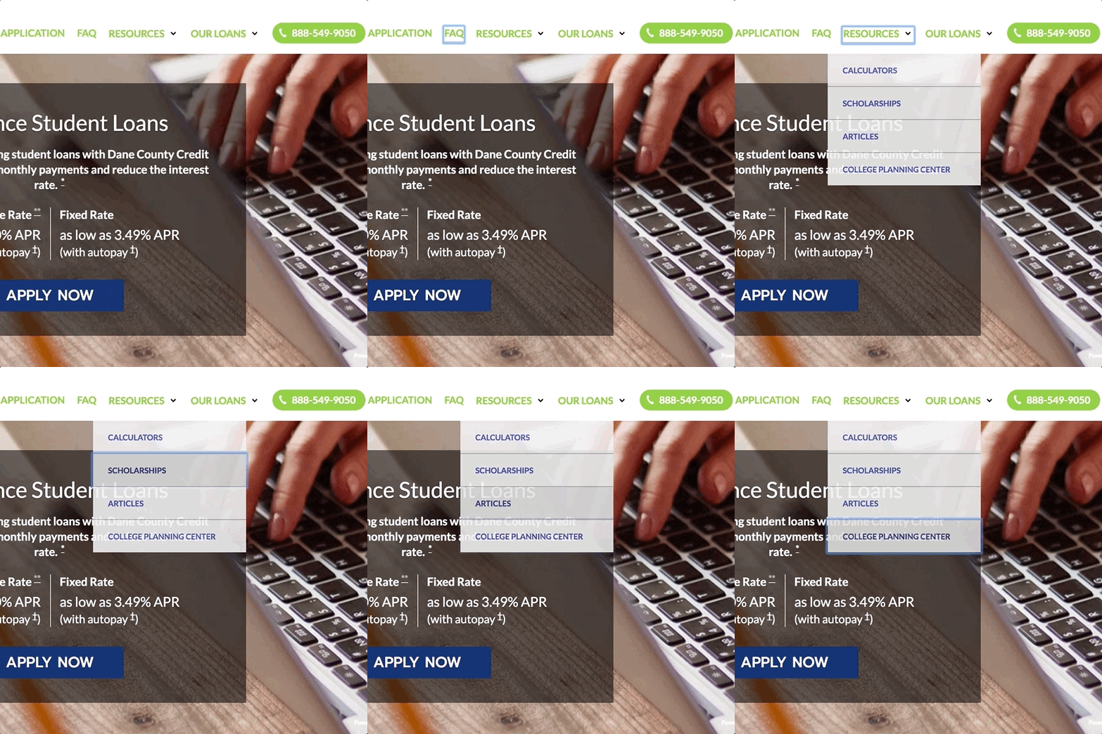
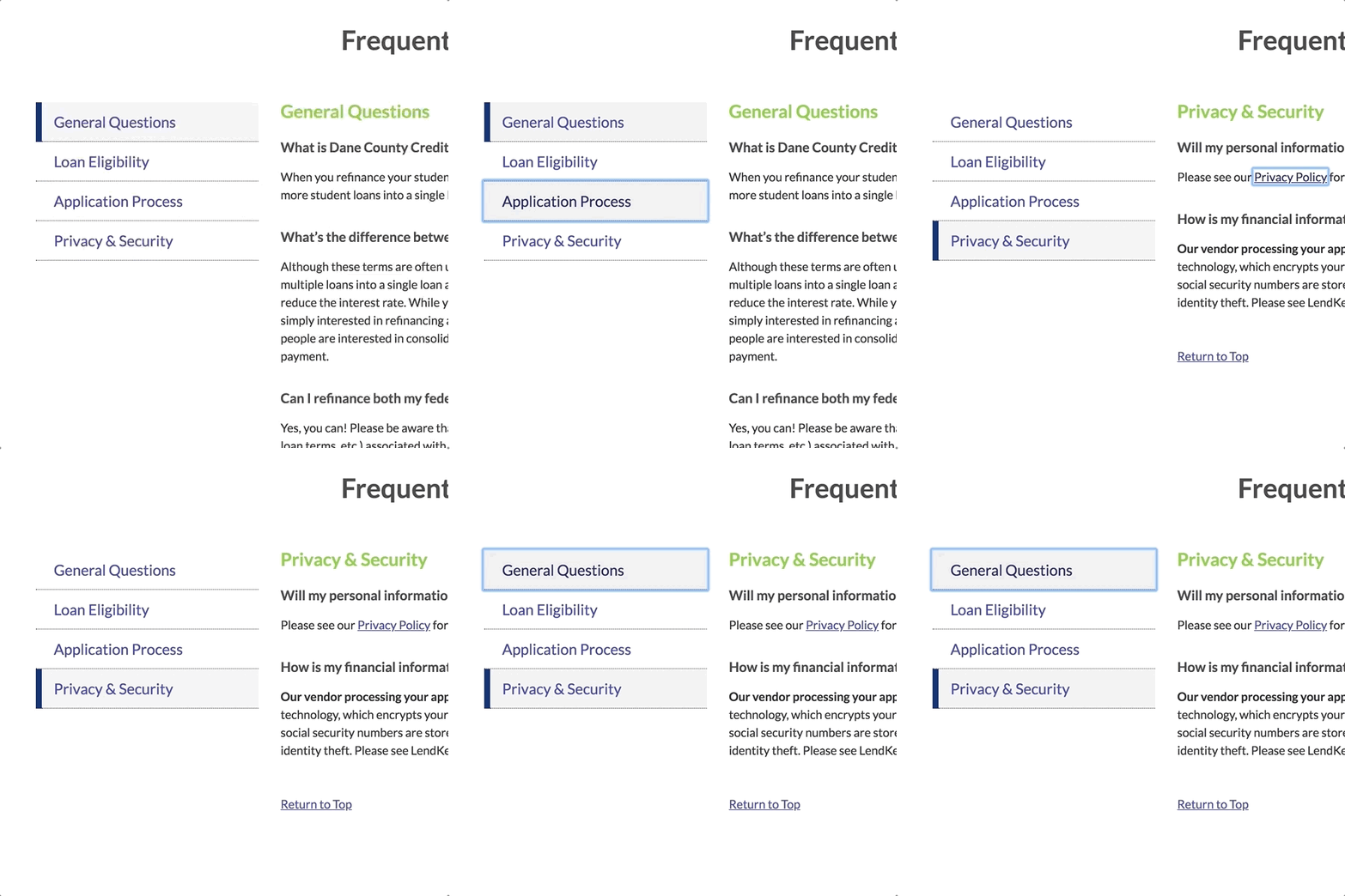
Designing a marketing page configurable through a Ruby-on-Rails CRUD app is relatively straightforward — we took the WordPress context that LendKey's lender relationship team would use to set up the first version of their landing pages and stripped it down to its essential parts to leave things familiar, but reduce the amount of overwhelm. Meeting requirements for accessibility as was necessary for the industry and their clients, however, added an additional level of complexity to the front-end — especially considering that tools for accessibility testing weren't as widespread as they are today.
I combed through W3C’s documentation to determine what considerations needed to be made, immersed myself in documentation related to manipulating color values and making other necessary allowances, and got to work.

03 / solution
In addition to ensuring the proper flow of elements when using a keyboard and operability with screen reader/assistive technology, the largest hurdle was ensuring that we installed guardrails for whatever brand colors were presented so they would meet the threshold for contrast and legibility according to WCAG 2.0.
Colors selected according to brand don't always make for excellent text contrast when applied to elements, so my response was to write a custom script that would check the contrast ratio of elements that had brand colors applied to them and adjust their lightness in order to meet the specified level to meet a WCAG 2.0 AA rating. To see it at work, check out this CodePen.
I also developed documentation for LendKey’s team outlining each accessibility standard pertinent to the landing page and how it was satisfied by our solution. Here’s to happier local lending!